Example comparison
G7 VS BRICS
A group comparison can look completely different depending on whether the metric is GDP, population, emissions, electricity generation or military expenditure.
The G7 and BRICS presets are useful because they show how economic, demographic and energy scale can point in different directions.
What the data reveals
Group leadership depends on the metric
- The published presets contain 7 G7 members and 11 BRICS members. Membership count matters before any total is interpreted.
- G7 leads on nominal GDP, at about 1.6 times the BRICS total. GDP coverage is 7/7 G7 members and 10/11 BRICS members. BRICS leads on population, at about 5.0 times the G7 total.
- BRICS leads on territorial CO2 emissions, at about 2.7 times the G7 total. Keeping the country segments visible shows which members create that difference.
Two blocs, five different comparisons
| Group | Members in app | Population | GDP | Military expenditure | Electricity generation | Territorial CO2 emissions |
|---|---|---|---|---|---|---|
| G7 | 7 | 787.42M 7/7; 2025 | $52.50T 7/7; 2025 | $1.35T 7/7; 2024 | 7,465 TWh 7/7; 2024 | 7,813 Mt CO₂ 7/7; 2024 |
| BRICS | 11 | 3.97B 11/11; 2025 | $32.30T 10/11; 2025 | $675.12B 10/11; 2024 | 15,997 TWh 11/11; 2024 | 21,438 Mt CO₂ 11/11; 2024 |
Read the members as well as the total
For additive metrics, Compare Countries keeps every member country visible as a separate bar segment while still showing the group total. This avoids hiding the fact that a large group total may be driven by one or two very large members.
The comparison should be read as a snapshot from the app's published metric catalog, not as a political ranking. Membership definitions come from the published country-group catalog, so the labels on this page mean exactly the member lists shown by the preset.
Load both country-group presets
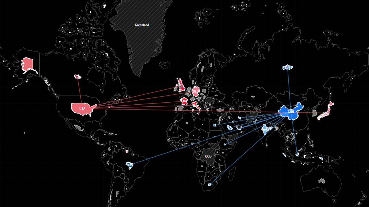
The preset loads the published G7 and BRICS membership lists as opposing groups. Begin with nominal GDP, inspect the contribution of each member, then keep the groups fixed while moving through population, electricity, emissions and military expenditure.
Sources used on this page
- World Development Indicators: Economic, demographic, industrial, defence, water and health indicators. Source
- International Energy Statistics: International oil, gas and electricity production. Source
Source reference years can differ by metric and by country. The interpretation above was reviewed against the displayed snapshot on 26 September 2026; check the linked source before citing a figure.