Example comparison
HIGHEST GDP PER CAPITA
GDP per capita changes the comparison from total economic size to average economic output per person.
Because it is a rate, it should not be added across countries. Compare Countries therefore displays it with a colour gradient instead of a group-total bar.
What the data reveals
Small economies rise when population is the denominator
- The first three entries are Luxembourg, Ireland, Switzerland. Their position reflects output per resident, not the overall size of their economies.
- The first value in the displayed ranking is about 2.3 times the twelfth. A gradient communicates that spread without pretending the values can be added.
- Small economies and territories can rise sharply because the denominator is small. The result should be read alongside total GDP, population and distributional measures rather than as a complete living-standards score.
The ranking is not a list of the largest economies
| Rank | Country | Value | Year |
|---|---|---|---|
| 1 | Luxembourg | $147,252 | 2025 |
| 2 | Ireland | $131,592 | 2025 |
| 3 | Switzerland | $114,769 | 2025 |
| 4 | Singapore | $98,814 | 2025 |
| 5 | Iceland | $98,323 | 2025 |
| 6 | Norway | $94,594 | 2025 |
| 7 | United States of America | $90,027 | 2025 |
| 8 | Denmark | $76,970 | 2025 |
| 9 | Macau | $75,902 | 2025 |
| 10 | Netherlands | $73,684 | 2025 |
| 11 | Qatar | $72,525 | 2025 |
| 12 | Australia | $65,130 | 2025 |
Average output is not household income
This is a useful example of why the app separates additive and non-additive metrics. A group can have a huge total GDP while its GDP per capita ranking tells a different story.
For rate metrics, the colour scale helps identify relative rank. When only selected countries are being compared, the gradient is scaled to that selected set so close differences remain visible.
Scan the world with a non-additive gradient
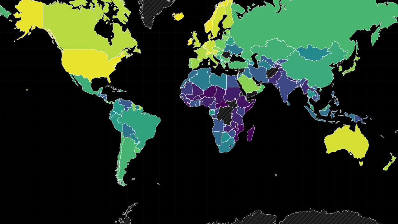
The preset opens the full-world GDP-per-capita gradient without forcing a country selection. Scan the global distribution first, then select a smaller peer set to make close values easier to distinguish.
Sources used on this page
- World Development Indicators: Economic, demographic, industrial, defence, water and health indicators. Source
Source reference years can differ by metric and by country. The interpretation above was reviewed against the displayed snapshot on 26 September 2026; check the linked source before citing a figure.