Example comparison
India vs China: the comparison changes by metric.
India and China are often compared as the two largest population centres in the world, but the visual story changes once GDP, GDP per capita and land area are shown beside population.
This example is useful because it separates scale from density: two countries can both be enormous in population while looking very different by area and income per person.
What the comparison shows
On a visual map, population highlights human scale, GDP highlights total economic output, and GDP per capita changes the question to average output per person. Land area is different again because it is a geographic measure rather than an annual economic or demographic statistic.
Use the interactive map to switch among these metrics without rebuilding the country pair. That makes it easier to see which comparisons are driven by people, which are driven by territory, and which are driven by economic output.
Map preview
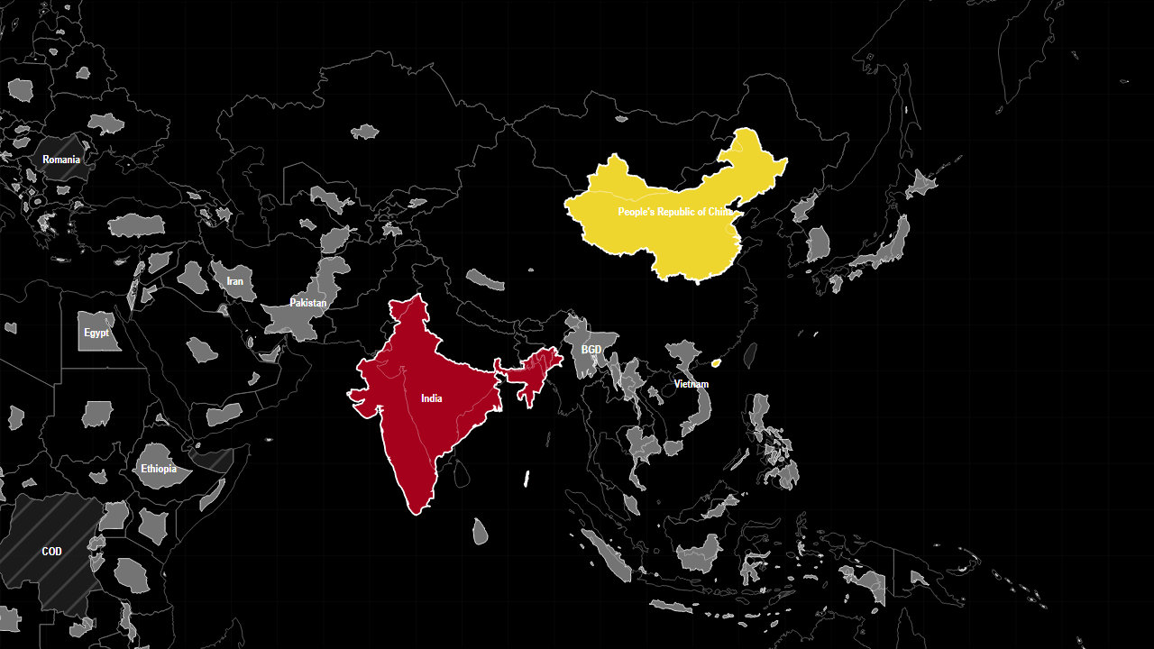
How to explore it on the map
Open the live map with this metric and country selection already loaded. After the map opens, you can change the countries, switch metrics, drag countries between groups, or clear the comparison and start again.
Sources used on this page
- World Development Indicators: Economic, demographic, industrial, defence, water and health indicators. Source
- Natural Earth 1:50m Admin 0 Countries: Geometry only. Source
Values are generated from the local Compare Countries data snapshot. Source reference years can differ by metric and by country.