Example comparison
LARGEST COUNTRIES BY LAND AREA
Land area is the natural starting point for a country comparison map, but it is also the easiest metric to misread on a familiar Mercator view.
Compare Countries uses frozen map geometry for boundaries and a special outline mode for land area so users can compare shapes more directly.
What the data reveals
The familiar world map overstates northern size
- Russia leads the geometry-derived ranking at 16.88M km²; it is about 1.7 times Canada.
- The first six countries in the table account for 61.77M km² of measured land area, yet their shapes and latitudes make them look less comparable on a fixed Mercator map.
- Moving outlines onto the same base removes position from the comparison. It exposes differences that are difficult to judge when Russia, Canada, China and the United States remain at very different latitudes.
Measured area anchors the visual comparison
| Rank | Country | Value | Year |
|---|---|---|---|
| 1 | Russia | 16.88M km² | geometry derived |
| 2 | Canada | 9.87M km² | geometry derived |
| 3 | United States of America | 9.44M km² | geometry derived |
| 4 | People's Republic of China | 9.37M km² | geometry derived |
| 5 | Brazil | 8.50M km² | geometry derived |
| 6 | Australia | 7.71M km² | geometry derived |
| 7 | India | 3.16M km² | geometry derived |
| 8 | Argentina | 2.78M km² | geometry derived |
| 9 | Kazakhstan | 2.71M km² | geometry derived |
| 10 | Democratic Republic of the Congo | 2.33M km² | geometry derived |
| 11 | Algeria | 2.32M km² | geometry derived |
| 12 | Greenland | 2.15M km² | geometry derived |
Why outline overlays beat visual memory
Large northern countries can look bigger on a Mercator map than their actual area ranking implies. A static ranking table helps anchor the visual map to numeric area values.
When using the app, drag one country onto another in Land Area mode to compare outlines. This is often clearer than relying on how countries appear in their normal map positions.
Place large-country outlines on one base
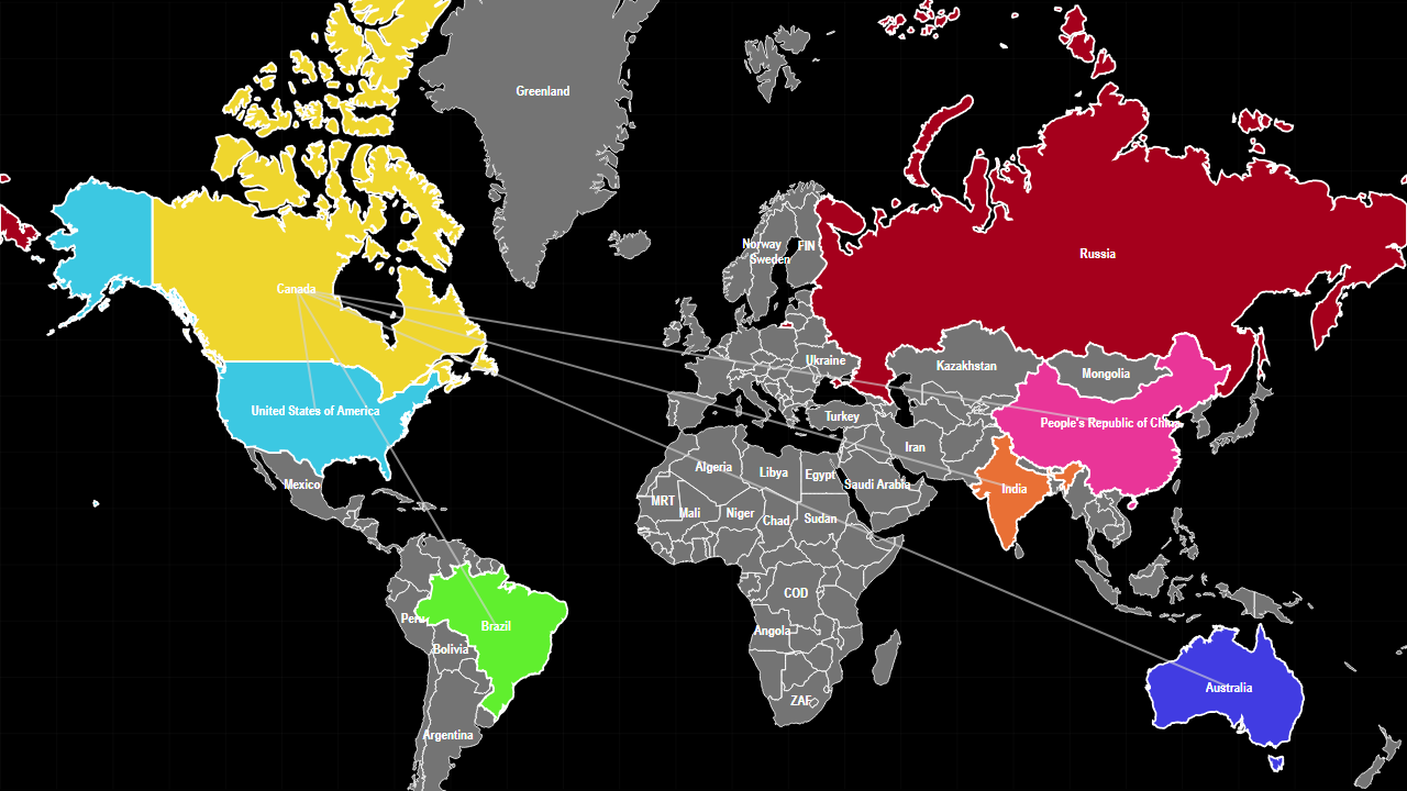
The preset uses Russia as the base outline and loads Canada, the United States, China, Brazil, Australia and India into the comparison group. Move or rotate outlines to compare shape and measured area on the same visual base.
Sources used on this page
- Natural Earth 1:50m Admin 0 Countries: Geometry only. Source
Source reference years can differ by metric and by country. The interpretation above was reviewed against the displayed snapshot on 26 September 2026; check the linked source before citing a figure.