Example comparison
MILITARY EXPENDITURE BY COUNTRY
Military expenditure is one of the clearest examples of an additive country metric: spending by multiple countries can be summed for a group comparison.
At the same time, the figure should be read with caution because reporting practices, exchange rates and source methodology can affect the comparison.
What the data reveals
The spending map is highly concentrated
- United States of America records about 3.2 times the expenditure of People's Republic of China in the current table.
- The first three countries account for about 70% of the combined value of the twelve rows shown. That concentration is why the comparison bar is dominated by a small number of segments.
- Absolute expenditure measures financial input, not readiness, procurement efficiency, force structure or outcomes. GDP and population provide context but do not turn spending into a capability score.
Absolute expenditure in the current snapshot
| Rank | Country | Value | Year |
|---|---|---|---|
| 1 | United States of America | $997.31B | 2024 |
| 2 | People's Republic of China | $313.66B | 2024 |
| 3 | Russia | $148.97B | 2024 |
| 4 | Germany | $88.46B | 2024 |
| 5 | India | $86.13B | 2024 |
| 6 | United Kingdom | $81.76B | 2024 |
| 7 | Saudi Arabia | $80.33B | 2024 |
| 8 | Ukraine | $64.70B | 2024 |
| 9 | France | $64.68B | 2024 |
| 10 | Japan | $55.27B | 2024 |
| 11 | South Korea | $47.57B | 2024 |
| 12 | Israel | $46.51B | 2024 |
Spending is not a capability score
A visual comparison helps reveal concentration. A few countries can dominate the global spending map, while many countries remain visible but relatively small in the bar.
The app keeps each country segment visible where possible so group totals do not obscure which countries are driving the comparison.
Compare the leading spending countries
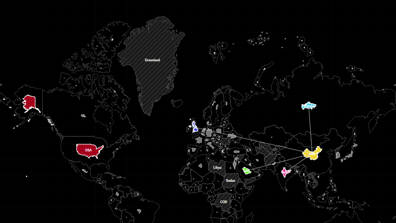
The preset places the United States against China, Russia, India, Saudi Arabia and the United Kingdom. Read the individual bar segments before comparing the group total, then add GDP or population context separately.
Sources used on this page
- World Development Indicators: Economic, demographic, industrial, defence, water and health indicators. Source
Source reference years can differ by metric and by country. The interpretation above was reviewed against the displayed snapshot on 26 September 2026; check the linked source before citing a figure.