Example comparison
POPULATION DENSITY BY COUNTRY
Population density divides people by land area, so it is not the same as population and cannot be added across a group.
It is most useful when the goal is to compare concentration rather than total scale.
What the data reveals
Small territories dominate a national-density ranking
- The first three entries are Macau, Monaco, Singapore. Very small land areas can produce high national averages even when total population is modest.
- The first density value is about 32.9 times the twelfth in the displayed table, which makes a rank-based colour scale more readable than a group total.
- National density compresses cities, farmland, mountains and uninhabited regions into one number. It is useful for broad comparison but cannot describe settlement patterns inside a country.
Concentration rather than population scale
| Rank | Country | Value | Year |
|---|---|---|---|
| 1 | Macau | 20,570 people/km² | 2023 |
| 2 | Monaco | 18,693 people/km² | 2023 |
| 3 | Singapore | 8,242 people/km² | 2023 |
| 4 | Hong Kong | 7,177 people/km² | 2023 |
| 5 | Bahrain | 1,971 people/km² | 2023 |
| 6 | Maldives | 1,765 people/km² | 2023 |
| 7 | Malta | 1,727 people/km² | 2023 |
| 8 | Bangladesh | 1,319 people/km² | 2023 |
| 9 | Sint Maarten | 1,257 people/km² | 2023 |
| 10 | Bermuda | 1,198 people/km² | 2023 |
| 11 | Barbados | 657 people/km² | 2023 |
| 12 | Mauritius | 625 people/km² | 2023 |
A national average hides internal geography
Dense countries and territories can appear small on a map but stand out strongly on a gradient. Very large countries can move in the opposite direction: visually large by area, but less dense by population.
In the app, selected countries use a gradient scaled to the selected set. That makes density differences easier to read when the countries being compared are close together numerically.
Use the full-world density gradient
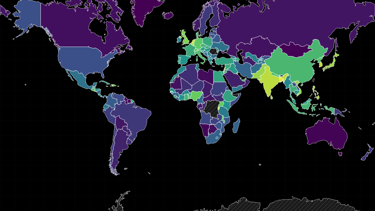
The preset opens a full-world density gradient because density is not additive. Select countries only after scanning the distribution; the gradient then rescales to the chosen set for a closer comparison.
Sources used on this page
- World Development Indicators: Economic, demographic, industrial, defence, water and health indicators. Source
- Natural Earth 1:50m Admin 0 Countries: Geometry only. Source
Source reference years can differ by metric and by country. The interpretation above was reviewed against the displayed snapshot on 26 September 2026; check the linked source before citing a figure.