Example comparison
UNITED STATES VS CANADA
The United States and Canada occupy a large share of North America, but a country-size comparison can hide the difference in population distribution and total economic output.
This page shows why land area, population, GDP and resource metrics should be compared separately instead of being mentally combined into one idea of country size.
What the data reveals
Similar land footprints, very different human scale
- The two land footprints differ by only about 4.4% in the map geometry, which is why the outline overlay begins as a close visual comparison.
- Population breaks that symmetry: the United States has about 8.2 times Canada’s population, and about 13.3 times its nominal GDP.
- The renewable internal freshwater totals are close: Canada is about 1.0 times the United States figure despite having a much smaller population and economy.
Area is only the starting point
| Metric | United States of America | Canada | Source |
|---|---|---|---|
| Land area | 9.44M km² geometry derived | 9.87M km² geometry derived | Natural Earth 1:50m Admin 0 Countries |
| Population | 341.78M 2025 | 41.65M 2025 | World Development Indicators |
| GDP | $30.77T 2025 | $2.32T 2025 | World Development Indicators |
| Renewable internal freshwater | 2,818 billion m³/year 2022 | 2,850 billion m³/year 2022 | World Development Indicators |
| Electricity generation | 4,393 TWh 2024 | 611 TWh 2024 | International Energy Statistics |
| Territorial CO2 emissions | 4,782 Mt CO₂ 2024 | 601 Mt CO₂ 2024 | International Energy Statistics |
What the shared border can hide
Land area makes the two countries feel visually comparable. Population and GDP make the comparison more uneven. Freshwater and electricity metrics add another dimension because natural-resource scale does not always move with population scale.
The app is designed for this exact pattern: start with an intuitive map comparison, then switch metrics to find where the intuition breaks.
Overlay the two outlines first
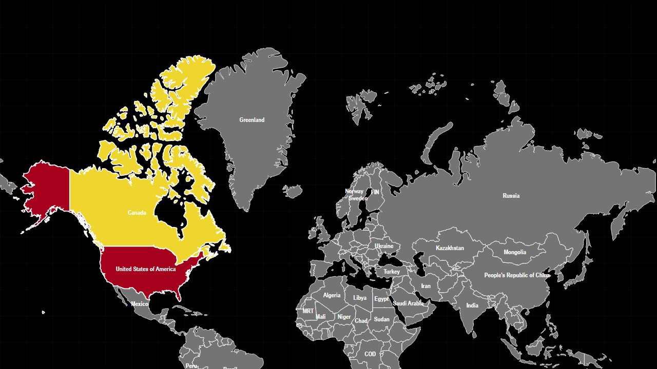
The preset opens in Land Area mode with the United States as the base and Canada as the comparison outline. After judging the shapes directly, keep both countries selected and switch to population, GDP, freshwater or electricity generation.
Sources used on this page
- Natural Earth 1:50m Admin 0 Countries: Geometry only. Source
- World Development Indicators: Economic, demographic, industrial, defence, water and health indicators. Source
- International Energy Statistics: International oil, gas and electricity production. Source
Source reference years can differ by metric and by country. The interpretation above was reviewed against the displayed snapshot on 26 September 2026; check the linked source before citing a figure.